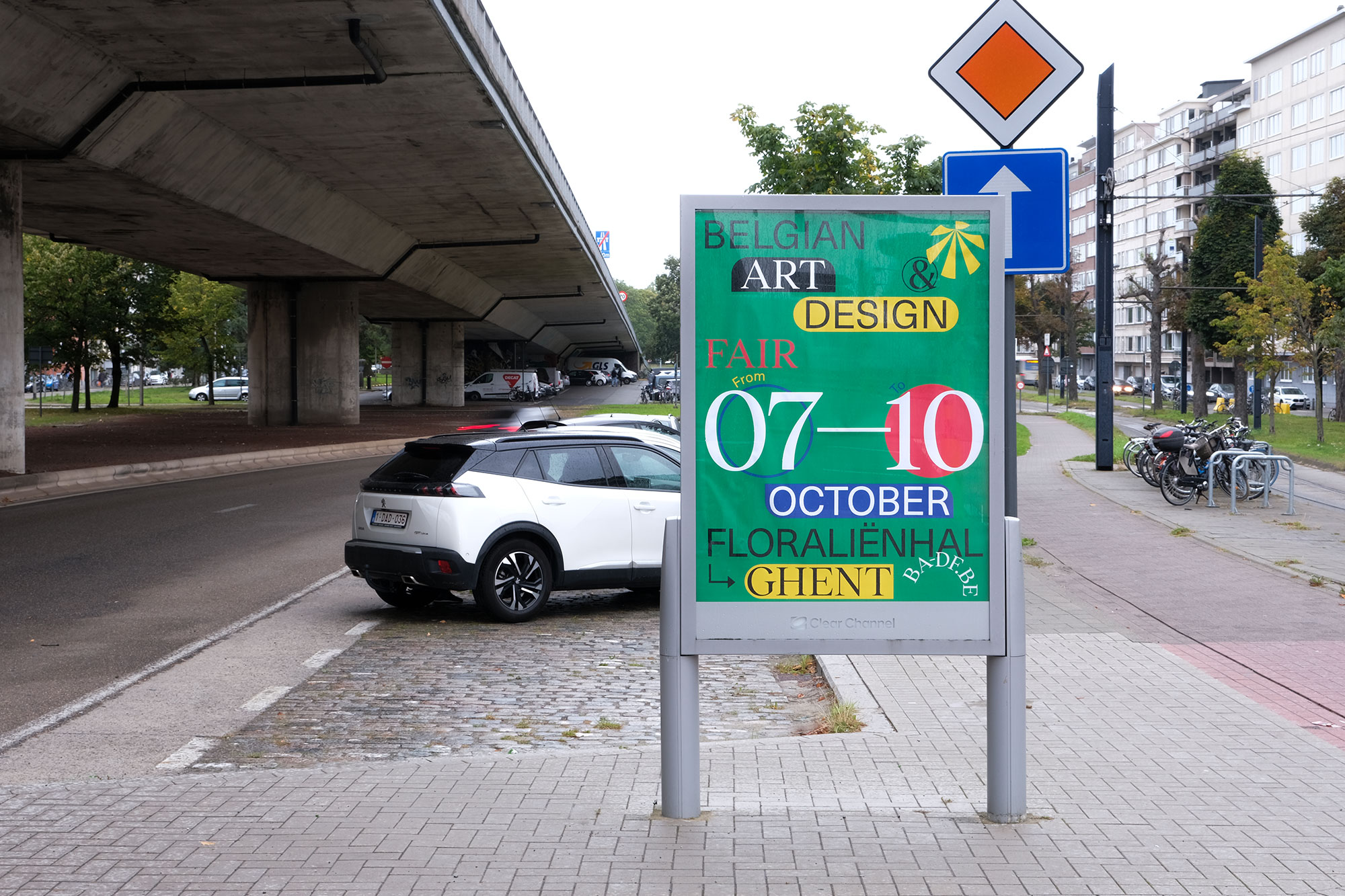
Kunsthumaniora Sint-Lucas Gent
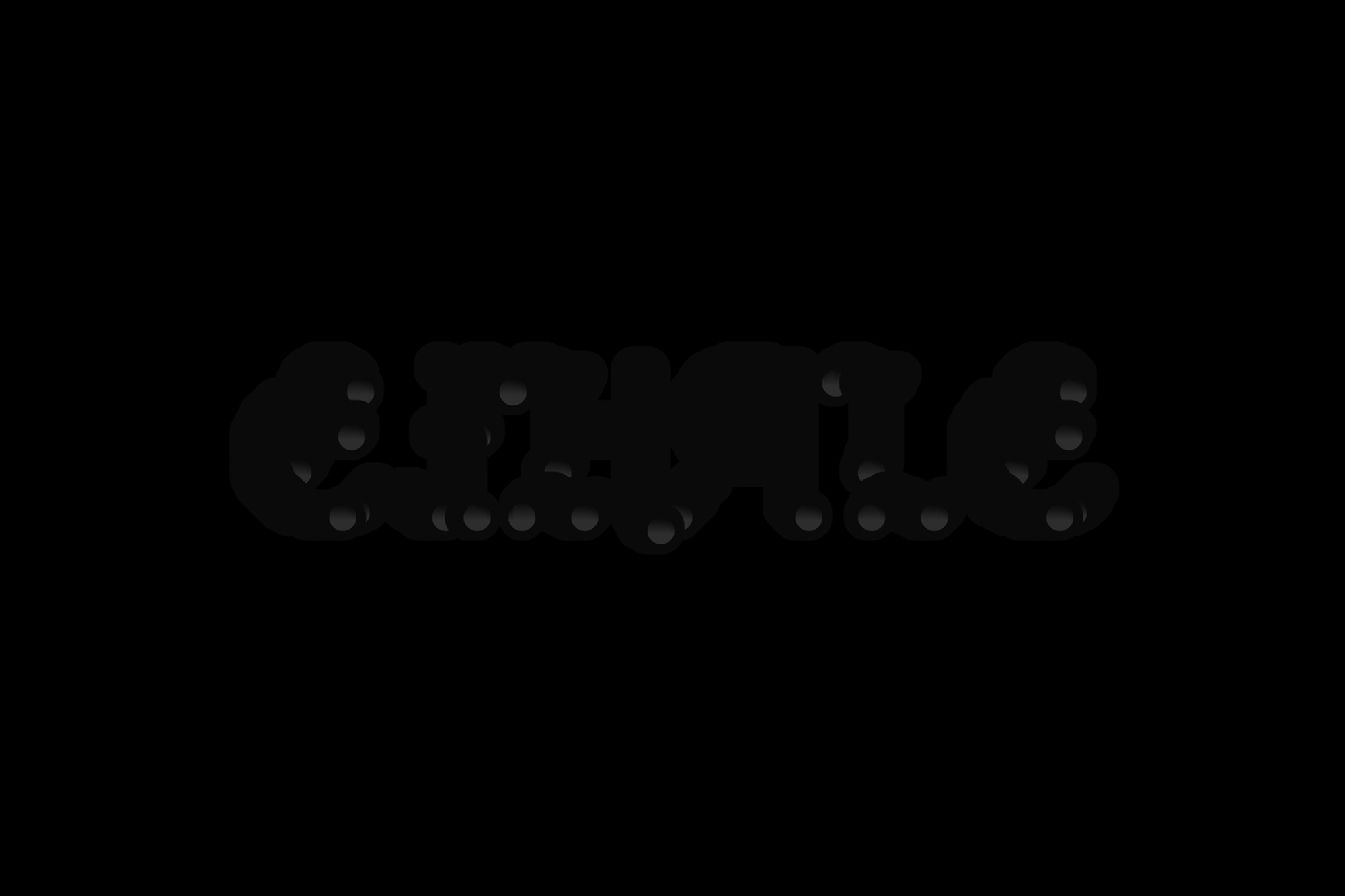
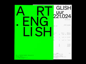
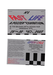
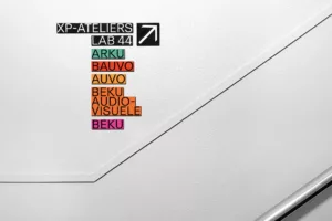
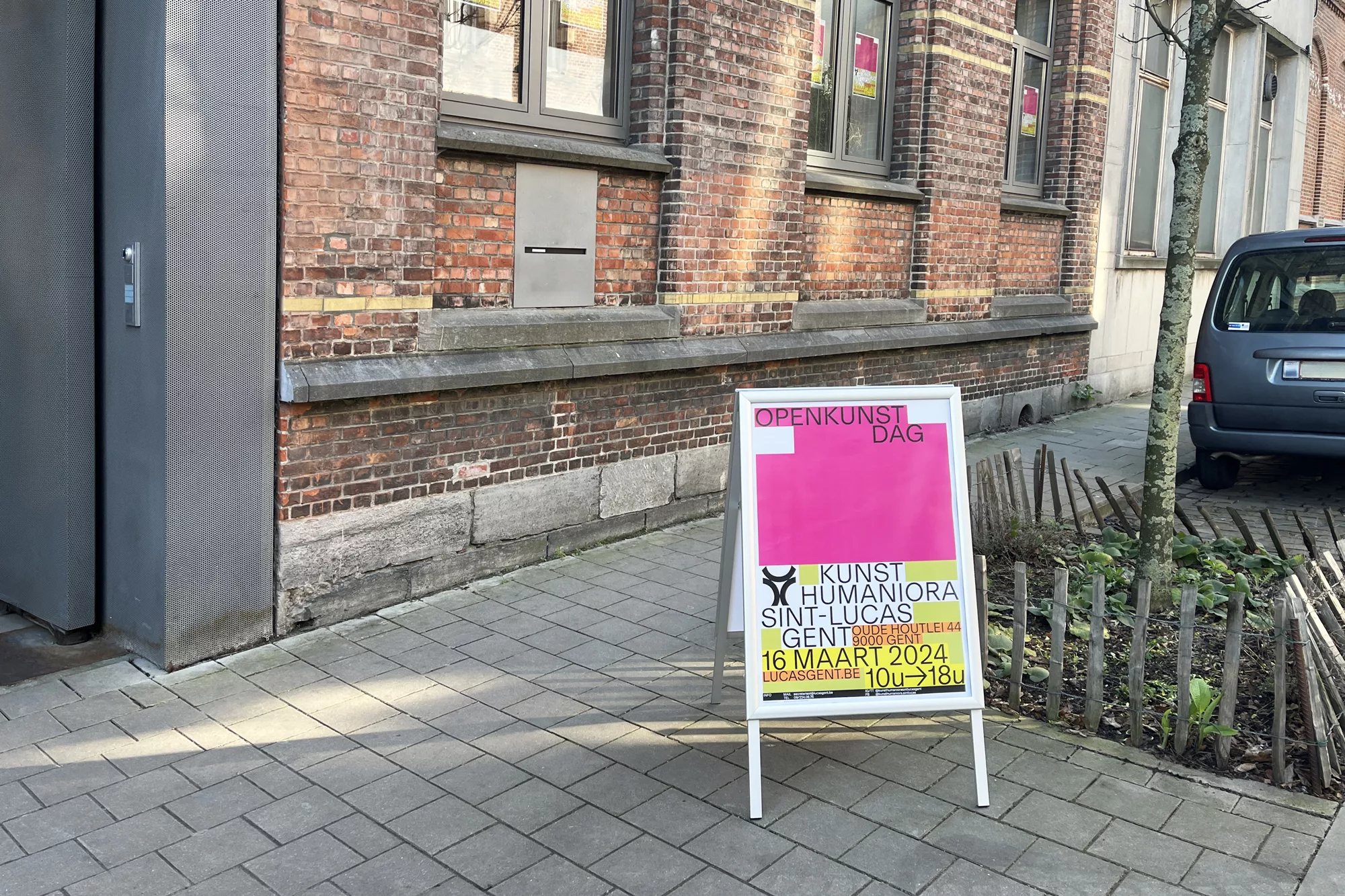
The new visual identity for Kunsthumaniora Sint-Lucas Gent focuses on creating a welcoming atmosphere for a secondary art school. This involved redesigning the school’s visual structure and directional signage. Additionally, we developed the school’s website and stationary to align with this new identity, ensuring consistency across all platforms. Inspired by the renowned architecture department of the school, we were inspired by graph papers. We incorporated distinctive colors for each section. This concept not only highlights the individuality of the different sections, yet maintains cohesion across the institution. The chosen typeface complements the existing logo which we fine-tuned.


Type
Identity, Printed matter, Website
Client
Kunsthumaniora Sint-Lucas Gent
Extra
website ↗
Year
2024