Website

Kunsthumaniora Sint-Lucas Gent
Identity
Kunsthumaniora Sint-Lucas Gent
2024
Identity
Kunsthumaniora Sint-Lucas Gent
2024

Kunsthumaniora Sint-Lucas Gent

Type Identity
Client Kunsthumaniora Sint-Lucas Gent
Extra website ↗
Year 2024

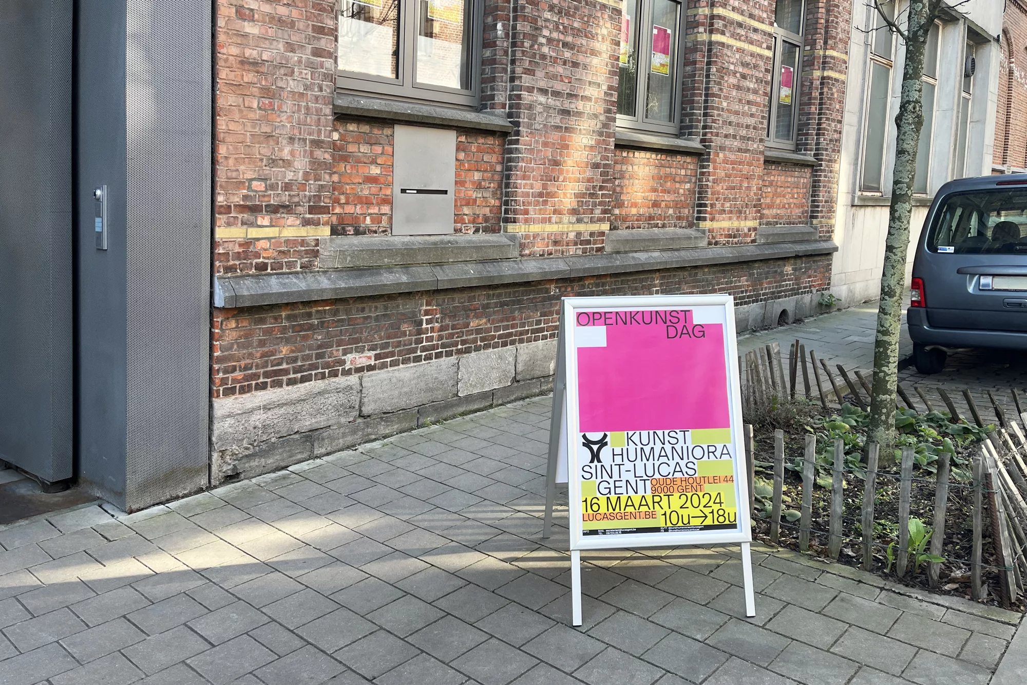
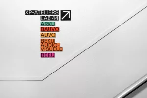
The new visual identity for Kunsthumaniora Sint-Lucas Gent focuses on creating a welcoming atmosphere for a secondary art school. This involved redesigning the school’s visual structure and directional signage. Additionally, we developed the school’s website and stationary to align with this new identity, ensuring consistency across all platforms. Inspired by the renowned architecture department of the school, we were inspired by graph papers. We incorporated distinctive colors for each section. This concept not only highlights the individuality of the different sections, yet maintains cohesion across the institution. The chosen typeface complements the existing logo which we fine-tuned.

Type Identity, Printed matter, Website
Client Kunsthumaniora Sint-Lucas Gent
Extra website ↗
Year 2024
WAY
Identity
WAY
2023
Identity
WAY
2023

WAY

Type Identity
Client WAY
Year 2023

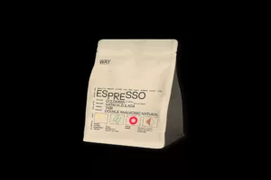
WAY is a specialty coffee roastery, a coffeehouse and a bakery in Ghent. The WAY brand identity draws its inspiration from the brand’s desire to showcase their expertise and meticulous approach to coffee production. In order to convey a scientific approach to coffee, the brand identity incorporates a playful approach to typography. It involves using various sizes of types, along with subscripts, superscripts and a play with the line-height. The identity also incorporates four symbols that are associated with specific traits of coffee.

Type Identity, Printed matter, Website
Client WAY
Year 2023
Karlijn Sonderen Smit
Printed matter
Karlijn Sonderen Smit
2023
Printed matter
Karlijn Sonderen Smit
2023

Karlijn Sonderen Smit

Type Printed matter
Client Karlijn Sonderen Smit
Extra Website ↗
Year 2023

The website designed for Karlijn Sonderen Smit presents her work in an unconventional manner. The site offers a chance to explore the diverse artistic practice of this auteur and theatermaker through a mix of personal images, drawings, and texts, whether self-created or curated from the internet. This amalgamation creates a distinctive narrative, occasionally leaning towards surprise or confusion.


Additionally, we designed flyers to showcase workshops organized by Karlijn. The flyers feature playful shapes, vibrant fluorescent colors and a play on typography.

Type Printed matter, Website
Client Karlijn Sonderen Smit
Extra Website ↗
Year 2023
Belgian Art & Design Fair 2023
Identity
Belgian Art & Design Fair
2023
Identity
Belgian Art & Design Fair
2023

Belgian Art & Design Fair 2023

Type Identity
Client Belgian Art & Design Fair
Extra BA&DF ↗
Year 2023

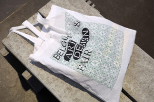
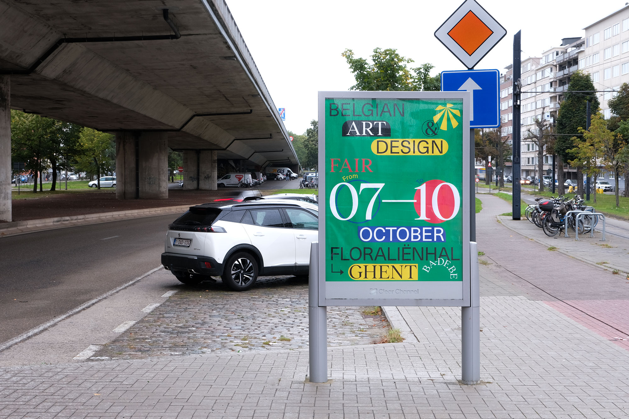
For the 2023 edition, Studio Studio seamlessly extended the visual identity designed in 2020, creating a connection between both editions.

The established design elements persist, contributing to a cohesive and easily recognizable brand identity. With higlighting more the used grid in the visual identity of 2023 it links the visual identity to the developed scenography in edition 2023.

Type Identity, Printed matter, Website
Client Belgian Art & Design Fair
Extra BA&DF ↗
Year 2023
Graphic Graphic
Creative Direction
Graphic Graphic
2023
Creative Direction
Graphic Graphic
2023

Graphic Graphic

Type Creative Direction
Client Graphic Graphic
Year 2023

The genesis of Graphic Graphic was sparked by a shared sentiment among Belgian graphic designers: a desire to dissolve the veil of unfamiliarity that shrouds our practices, discipline and more generally our body of work. We questioned whether we, as graphic designers, could collectively define what makes Belgian graphic design particular. In response to this challenge, Graphic Graphic was founded with the intention of making the Belgian graphic design scene more accessible, comprehensible and appreciated.


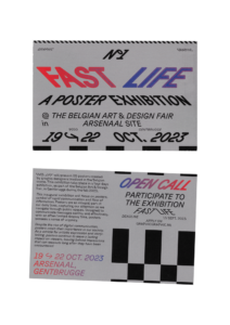
Graphic Graphic is a platform that was founded by Studio Studio during the spring 2023. The first event was entitled Fast Life and was focusing on posters. This exhibition was held during the Belgian Art & Design Fair 2023 at Arsenaal Gentbrugge.

Type Creative Direction, Identity, Printed matter, Publication, Website
Client Graphic Graphic
Year 2023
Studio Vagant
Website
Studio Vagant
2023
Website
Studio Vagant
2023

Studio Vagant

Type Website
Client Studio Vagant
Extra Stroll ↗
Year 2023

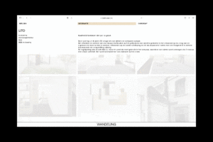
Studio Vagant, located in Ghent, specializes in a combination of architecture, interior, and furniture design. Their focus revolves around a minimalist and high-end approach. The website embodies their design philosophy, with an emphasis on simplicity and clean aesthetics.


The website is designed as a walk-through of their work, allowing users to navigate through their diverse portfolio of projects. On the front page, a selection of projects is randomly displayed, ensuring that each visit creates a different stroll through the works. Additionally, the background colors dynamically adjust based on the type of project setting the right tone that echoes the essence of their creations.

Type Website
Client Studio Vagant
Extra Stroll ↗
Year 2023
Mokja!
Website
Ae Jin Huys
2023
Website
Ae Jin Huys
2023

Mokja!

Type Website
Client Ae Jin Huys
Extra Website
Year 2023

Mokja! by Ae Jin Huys, inspired by Korean culinary philosophy, delivers a harmonious blend of flavors and textures. Design and developed by Studio Studio, the website reflects this ethos, providing a platform to explore Mokja’s creations.

Ae Jin Huys’ dedication to Korean culinary traditions shines on the site. it offers insights into the chef’s expertise and cultural commitment.

Type Website
Client Ae Jin Huys
Extra Website
Year 2023
Ponton magazine
Identity
Z33 & Designregio Kortrijk
2022
Identity
Z33 & Designregio Kortrijk
2022

Ponton magazine

Type Identity
Client Z33 & Designregio Kortrijk
Year 2022

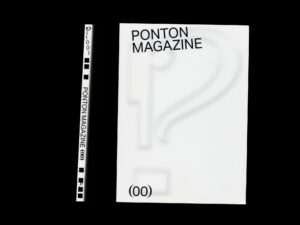
Ponton magazine strives to create a connection between designers and people. The first issue centers around five young and emerging designers, sharing some of their stories. Additionally, Ponton features interviews with other designers. The magazine’s primary goal is to inspire readers and focus on the creative journey of designers rather than just their final products. Through this approach, Ponton sheds light on the various challenges designers face in today’s creative process, particularly young and recently graduated ones. It aims to foster dialogue, encourage reflection and promote knowledge sharing through diverse presentation and working methods.

Ponton serves as both a carrier of content and a showcase for talents. It offers designers a platform to discuss and share their ambitions, doubts, successes, and failures. To convey the essence of the creative process, which is often a blurry and evolving journey, we employed a pixellated typeface. This typeface not only introduces varying degrees of blur and pixelation but also embodies the gradual clarity that emerges from the mist of creation. A sans-serif typeface is used alongside giving a sense of clarity throught the process.

Furthermore, to maintain a clear overview of the magazine while breaking away from linearity, we developed a system of keywords and labels that extend throughout every article. These labels can be found at the beginning of the magazine, inviting each reader to interpret and comprehend the content in their own way. This design choice aims to create an engaging reading experience, departing from the conventional structure.

Additionally, the magazine places special emphasis on the center of its editorial object: the spine. The layout and structural choices are a tangible representation of how Ponton literally bridges the gap, symbolizing its core mission.
Type Identity, Printed matter, Publication, Website
Client Z33 & Designregio Kortrijk
Year 2022
Arsenaal
Identity
Arsenaal
2022
Identity
Arsenaal
2022

Arsenaal

Type Identity
Client Arsenaal
Extra
Year 2022

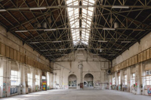
Arsenaal is a former train repair centre built in the late nineties century by the national railway company. This is a large complex of industrial buildings in Ghent that were left by the railway company in 2019. It has since become a place illegally used by street artists, making it a popular and underground destination.

In 2022, it was acted: parts of the site could be used as a new cultural venue for the city. in September 2022, a first month of festivities is taking place for which we created an identity.

The identity is a tribute to the industrial metallic rooftop structures of the Arsenaal site. Playing with only a few parameters we created a cheerful and rhythmic aesthetic. The background lines together with the typography (Haüser) recall the systematic architectural motifs highlighting their specificities. The text, over and above the background lines creates sequences of patterns emphasized by its own justification to the margins.

Type Identity, Printed matter, Website
Client Arsenaal
Extra
Year 2022
Phono
Creative Direction
Phono
2022
Creative Direction
Phono
2022

Phono

Type Creative Direction
Client Phono
Extra Phono ↗
Year 2022

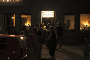
Phono, a listening bar in Ghent, immerses patrons in a unique blend of sound, food, and drinks. During the Gentse Feesten 2022, Phono made its debut in a pop-up location in the city center of Ghent, featuring live DJ performances, food and special cocktails. To mark this event, we introduced Phono’s identity for the first time. This encompassed interior interventions, including the bar and door, alongside the creation of a website, business cards, and a lightbox.


The identity is inspired by graphic representation of sounds and phonemes. We created a grid as a starting point that stretches and adjusts to the dimensions of the communicating medium, playing with circles and dots. Each circle represents one of the highlight of the bar: music, food and beverages.

Type Creative Direction, Identity, Website
Client Phono
Extra Phono ↗
Year 2022
Stijn Cole
Website
Stijn Cole
2022
Website
Stijn Cole
2022

Stijn Cole

Type Website
Client Stijn Cole
Extra 👀 Website
Year 2022

Stijn Cole is a multiplidinary artist living and working in Belgium. His choice of media is eclectic: looking at his practice you’ll find video, sculpture, painting, photography and graphics, through both abstract and figurative pieces.


The site presents the variety of works of art created by Stijn and information on current exhibitions.We set up a direct link from his Instagram account allowing him to post simultaneously on Instagram and the website.The website displays, in a simplistic four columns grid, pictures and information about his practice. The clear content is disrupted by an overlapping box system, producing subtle navigation happennings through the website.

Type Website
Client Stijn Cole
Extra 👀 Website
Year 2022
Lore Snauwaert
Website
Lore Snauwaert
2021
Website
Lore Snauwaert
2021

Lore Snauwaert

Type Website
Client Lore Snauwaert
Extra
Year 2021

Lore Snauwaert is a versatile designer and artist blending the realms of graphic design and cooking. The website is designed with a dynamic 3-column layout, each column functioning independently. Within this structure, every column has its distinct description and focus, providing a glimpse into Lore’s diverse practices.

Clicking on each image reveals a caption beneath, adding an element of surprise and interaction through the website.

Type Website
Client Lore Snauwaert
Extra
Year 2021
Belgian Art & Design Fair
Identity
IJV-IFAS
2021
Identity
IJV-IFAS
2021

Belgian Art & Design Fair

Type Identity
Client IJV-IFAS
Extra 🎪 Website
Year 2021

The Belgian Art & Design Fair is an annual fair showcasing and promoting Belgian art and design. It acts as a fun fair where the boundaries between the two disciplines are merged, blent and blurred. It is the only fair in Belgium that offers to combine the two practices and mingle them into a single event.


In 2019, we designed a new visual identity for the fair. It started with an elementary concept following the idea of the exhibition: nothing is the same, everything is different. While a wide range of styles, disciplines and processes are displayed, the identity centres around the notion of eclecticism, closely resonating with the scenography designed by Doorzon interior architects and Theo De Meyer.

With the intention to be used and adapted for further events during upcoming years, the identity of The Belgian Art & Design Fair works as a system. Each visual is a playground that constantly uses different elements; a system that challenges itself into inventing new solutions for various events, visuals, single creators as well as for collective exhibitions.

Colors can be adapted, placement, fonts, shapes, to create continuous possibilities. It was created as a lasting and identifiable part of the Belgian art and design community, including the red, yellow and black colors of the Belgian flag.

Type Identity, Printed matter, Publication, Website
Client IJV-IFAS
Extra 🎪 Website
Year 2021
Maison Eclectique
Printed matter
Moniek E. Bucquoye
2021
Printed matter
Moniek E. Bucquoye
2021

Maison Eclectique

Type Printed matter
Client Moniek E. Bucquoye
Extra ✨ Website
Year 2021

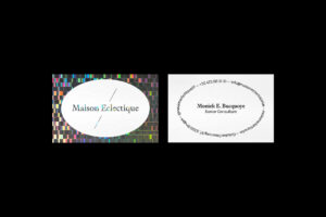
Maison Electique was created by Moniek E. Bucquoye to offer a single place for art, design and architecture.

The identity relies around a circular logo and a straight line, as the typefaces does. We used the Signifier typeface which combines straight vertical and horizontal details to an English Roman type from the 17th century.

Type Printed matter, Website
Client Moniek E. Bucquoye
Extra ✨ Website
Year 2021
Start To Collect
Identity
Start To Collect
2021
Identity
Start To Collect
2021

Start To Collect

Type Identity
Client Start To Collect
Extra Website
Year 2021

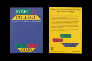
Start To Collect serves as a platform tailored for individuals new to art and design collecting. Studio Studio handled the branding, website development, and membership campaign for this initiative.
This platform is designed to be user-friendly, offering a clean interface and distinct sections dedicated to exploring art and design. On the homepage, an emphasis is placed on accessibility for novice collectors, showcasing an overview of services. The website’s primary focus appears to be on educating and guiding users through the journey of initiating their own art and design collections.
The branding is a dynamic visual identity, adaptable to various media channels, ensuring a cohesive and versatile representation across different platforms.

Type Identity, Printed matter, Website
Client Start To Collect
Extra Website
Year 2021
Another Graphic
Identity
Self-initiated
2019
Identity
Self-initiated
2019

Another Graphic

Type Identity
Client Self-initiated
Extra 💙 website
Year 2019

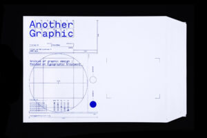
Another Graphic is a digital archive focusing on typographic treatment within graphic design practices. We have been curating this archive for about 10 years, allowing us to share our interest in typography but also continue to look for exciting development in the field and get curious about other designers works.


Over the years we noticed a growing interest for this digital archive and consequently we decided to take a step further and create a specific identity for it. Alongside, we also developped an online platform working as a tool to research, classify and find data within the archive.


Our visual aesthetic draws inspiration from the concept of a classified archive: a set of classified documents kept for consultation. Every design element is thoughtfully considered, enhancing the user experience and inviting seamless engagement with the content.


The Monotesk font used in the identity is a typeface we designed in collaboration with Emma Marichal exclusively for this platform and new identity. It is a typeface at the interesction of a grotesk and a monospaced, an hybrid version of a typewriter font.


From its humble origins as a digital repository, Another Graphic has blossomed into a vibrant community hub, accessible through the website, anothergraphic.org, and the social media platforms @anothergraphicdotorg (Instagram, Pinterest, Tumblr, Facebook). Our mission remains unwavering: to cultivate a global network of creatives united by a shared passion for graphic design, with a particular focus on pushing the boundaries of typographic innovation.
Type Identity, Typography, Website
Client Self-initiated
Extra 💙 website
Year 2019
Toegepast 20
Creative Direction
Cultuurplatform Design & Z33 (Provincie Limburg)
-
2015
Creative Direction
Cultuurplatform Design & Z33 (Provincie Limburg)
-
2015

Toegepast 20

Type Creative Direction
Client Cultuurplatform Design & Z33 (Provincie Limburg)
Extra -
Year 2015

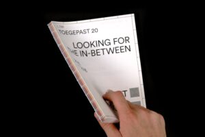
Toegepast is a design competition where designers are selected by Cultuurplatform Design, in collaboration with House for contemporary art Z33, to embark on a year-long project of their own.

Collaborating with furniture designer Adriaan Tas, Studio Studio curated the scenography and graphic design for the Toegepast 20 exhibition. Emphasizing both the process and the final product, the exhibition employs an archive system that showcases not only the outcomes but also the sequential steps taken. The archive categorizes design stages into input, process, and output, each marked with a symbol that defines the custom-made archive system.

Type Creative Direction, Identity, Printed matter, Publication, Website
Client Cultuurplatform Design & Z33 (Provincie Limburg)
Extra -
Year 2015
The Graphic Nomad
Printed matter
KASK
2014
Printed matter
KASK
2014

The Graphic Nomad

Type Printed matter
Client KASK
Year 2014

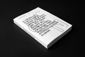
The Graphic Nomad is a research initiative delving into the impact of globalization through cross-cultural exploration. The project transforms virtual connections into tangible experiences, employing graphic design as a universal language on an international scale. Explore the essence of this transformative journey in the book, available for order here.

Leveraging contemporary mobility and connectivity, it was possible to traverse Europe, uncovering distinctive local graphic nuances. Initiating projects in diverse locations, we engaged with native graphic designers, sparking thought-provoking conversations that pushed the boundaries of creativity. Cultural traits became the foundation for translating concepts into dynamic, multi-disciplinary graphic design projects.

Witness the entire spectrum of the ventures on the website: www.thegraphicnomad.com

Type Printed matter, Publication, Website
Client KASK
Year 2014