Typography

Another Graphic
Identity
Self-initiated
2019
Identity
Self-initiated
2019

Another Graphic

Type Identity
Client Self-initiated
Extra 💙 website
Year 2019

Another Graphic is a digital archive focusing on typographic treatment within graphic design practices. We have been curating this archive for about 10 years, allowing us to share our interest in typography but also continue to look for exciting development in the field and get curious about other designers works.


Over the years we noticed a growing interest for this digital archive and consequently we decided to take a step further and create a specific identity for it. Alongside, we also developped an online platform working as a tool to research, classify and find data within the archive.


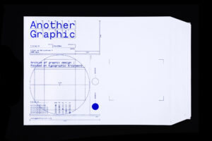
Our visual aesthetic draws inspiration from the concept of a classified archive: a set of classified documents kept for consultation. Every design element is thoughtfully considered, enhancing the user experience and inviting seamless engagement with the content.


The Monotesk font used in the identity is a typeface we designed in collaboration with Emma Marichal exclusively for this platform and new identity. It is a typeface at the interesction of a grotesk and a monospaced, an hybrid version of a typewriter font.


From its humble origins as a digital repository, Another Graphic has blossomed into a vibrant community hub, accessible through the website, anothergraphic.org, and the social media platforms @anothergraphicdotorg (Instagram, Pinterest, Tumblr, Facebook). Our mission remains unwavering: to cultivate a global network of creatives united by a shared passion for graphic design, with a particular focus on pushing the boundaries of typographic innovation.

Type Identity, Typography, Website
Client Self-initiated
Extra 💙 website
Year 2019
One of A Type
Typography
Ciao Ciao Studio
i.c.w. Palermo Italian Capital of Culture
2018
Typography
Ciao Ciao Studio
i.c.w. Palermo Italian Capital of Culture
2018

One of A Type

Type Typography
Client Ciao Ciao Studio
Extra i.c.w. Palermo Italian Capital of Culture
Year 2018

Ciao Ciao Studio organised a typography exhibition, calling international designers to join a month-long pop-up event during the festival of Palermo Italian Capital of Culture 2018.

Studio Studio was asked to design a single letter of the alphabet based on our own vision of the city of Palermo. The letter H is carefully constructed to reflect the sophistication of Palermo’s architecture and impression. To emphasize this historical context, the proportions of established, familiar fonts were retained in the design of the letter. A striking feature of the letter is the arch used as a crossbar. This element was taken directly from the (pointed) arch forms found in various historically important buildings. The serifs are unusually built up, although they provide a balanced typeface; they unobtrusively represent Palermo’s own eclecticism.

The sum of all the letters designed by the designers creates a dissonant alphabet, showed at the exhibition.

Ciao Ciao Studio under the patronage of Palermo Italian Capital of Culture and AIAP – Italian Association of Visual Communication Design

Type Typography
Client Ciao Ciao Studio
Extra i.c.w. Palermo Italian Capital of Culture
Year 2018
Nike SS16 T-shirts
Printed matter
Nike USA
SS16
2016
Printed matter
Nike USA
SS16
2016

Nike SS16 T-shirts

Type Printed matter
Client Nike USA
Extra SS16
Year 2016

Following the creative journey and graphic explorations of The Graphic Nomad, the task extended to crafting two T-shirts for the Nike SS16 collection. Psychedelic rhythms intertwine with the iconic Nike logo and the signature line ‘Just do it’.

Type Printed matter, Typography
Client Nike USA
Extra SS16
Year 2016