

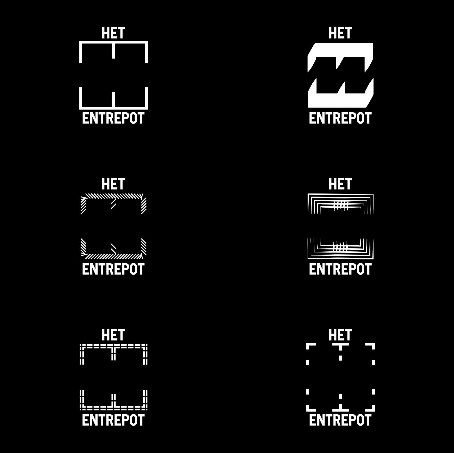
Het Entrepot is an open house and creative workspace for young talent in Bruges. For a pitch to develop their new visual identity, Studio Studio proposed a system rooted in the literal meaning of the name: entrepot, a warehouse.
The concept treats the letter E as a structural container. Content, whether image, texture, colour or typography, is placed inside the letterform, turning it into a display case that changes with every application. The E is not a logo in the conventional sense. It is a frame: a fixed shape that holds whatever the organisation puts into it. Line weight, proportion and configuration can vary, but the structural principle remains constant.
A visual identity for a space that stores possibilities, built as a form that stores content.
This proposal was not selected, unfortunately. (We still love it.)


