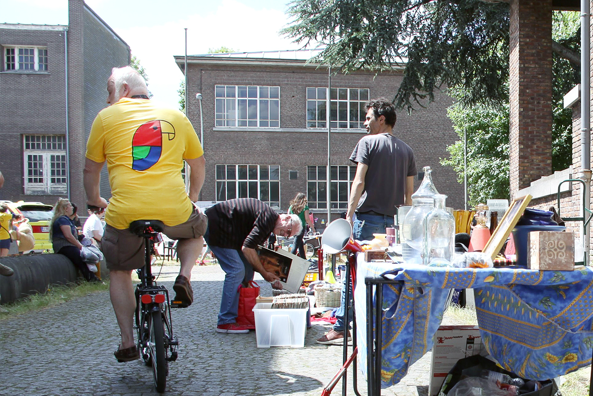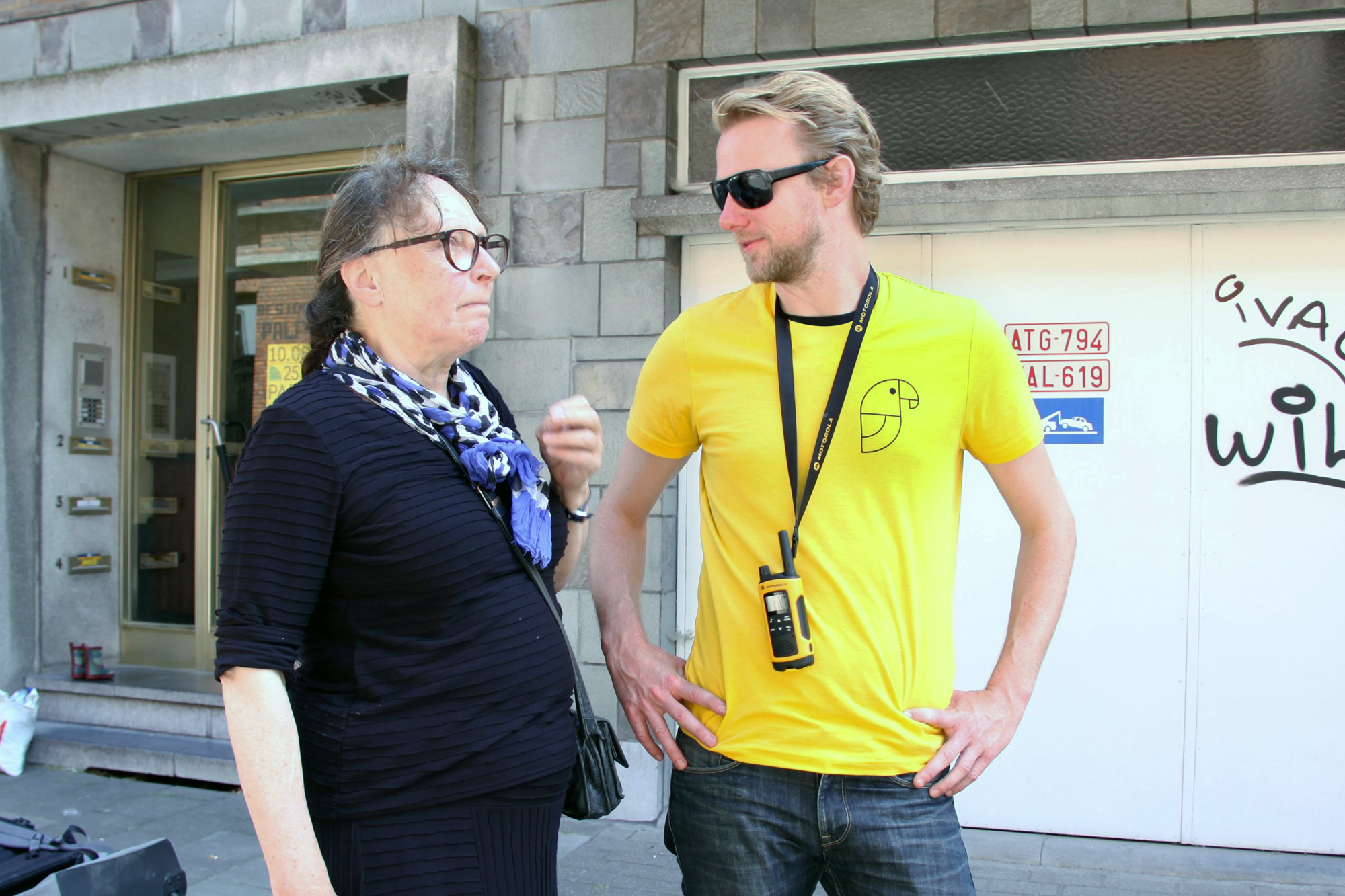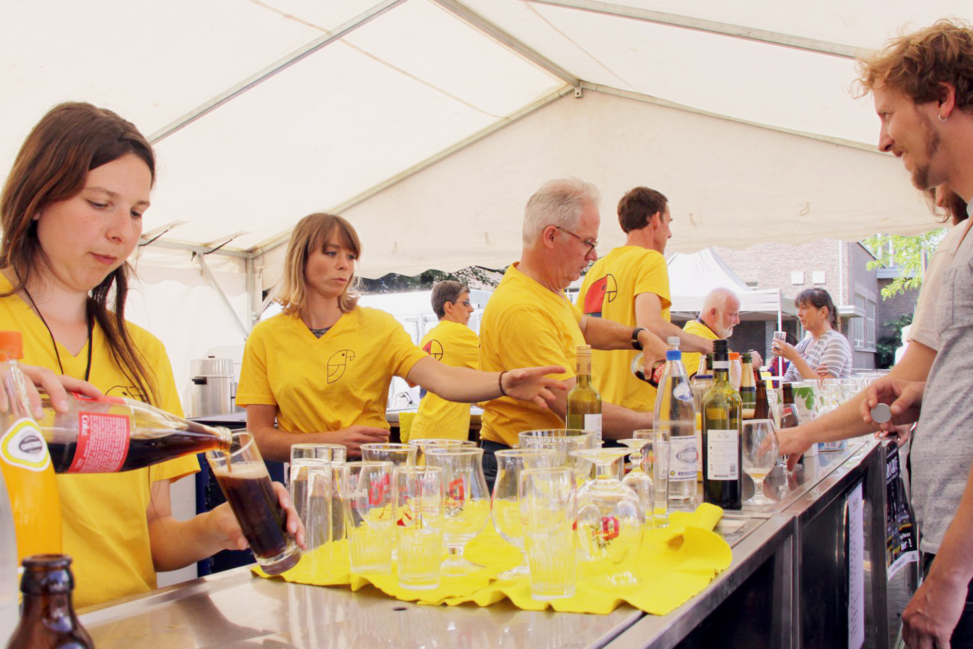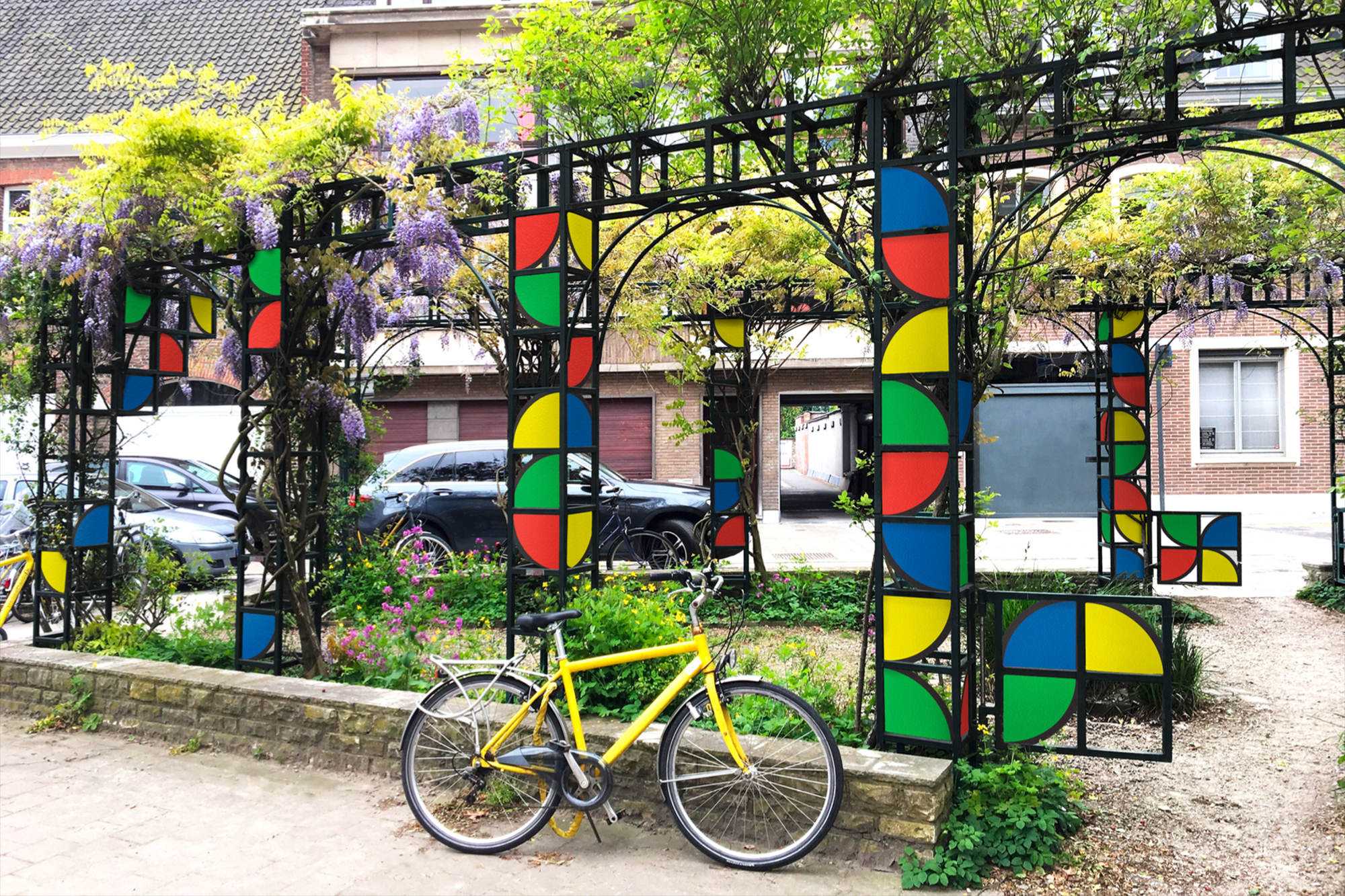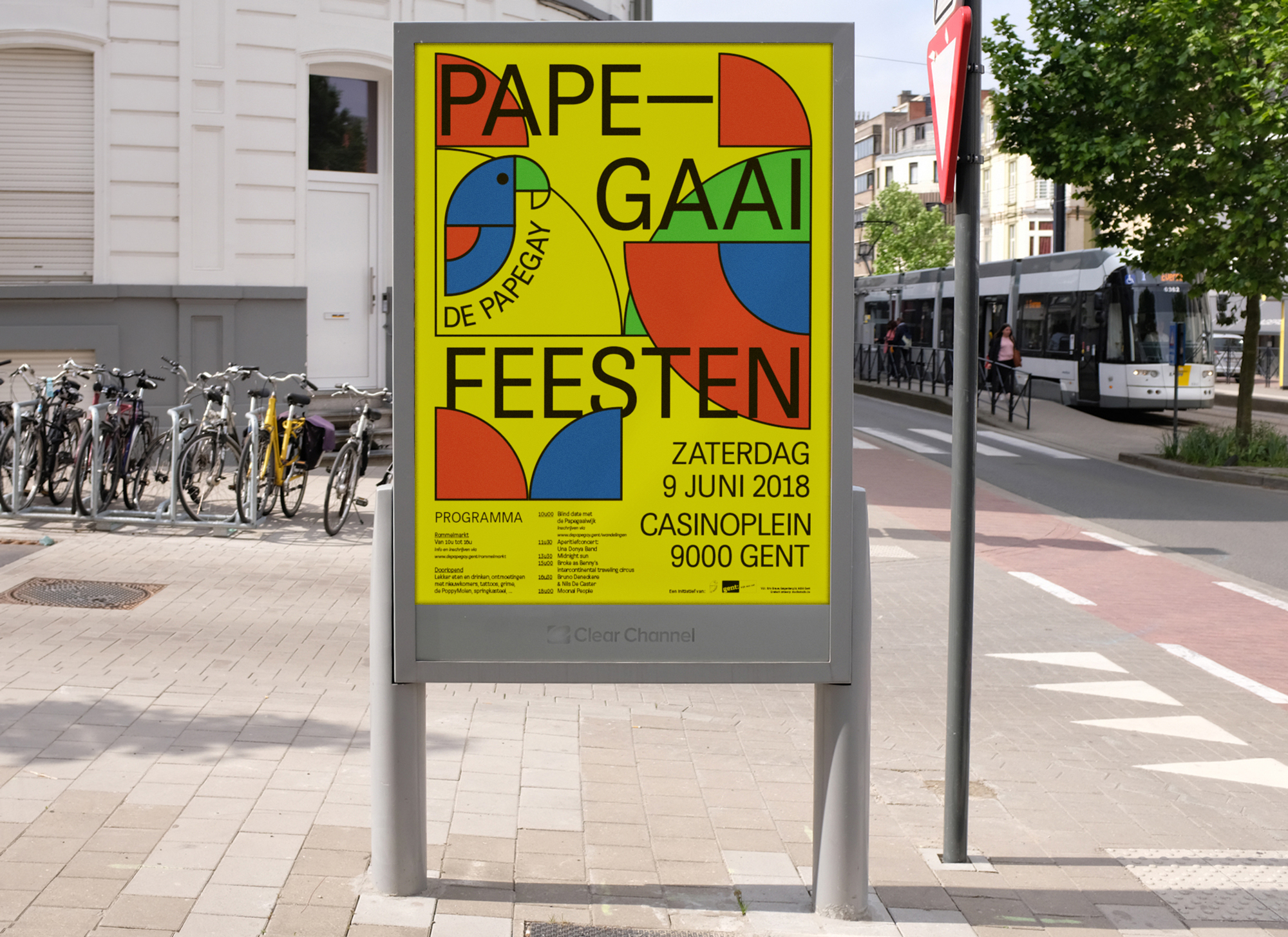
De Papega(e)y is an association established in 1992 to acquire one plot of land at the intersection of Papegaaistraat and Twaalfkameren in Ghent. Studio Studio designed the visual identity, taking its form directly from that location. The logo is traced from the sharp, distinctive outline of the street corner the association exists to secure, and the same shape carries across posters, flyers, the large-scale banners and the garments, so that every application returns to the same fragment of the city map.
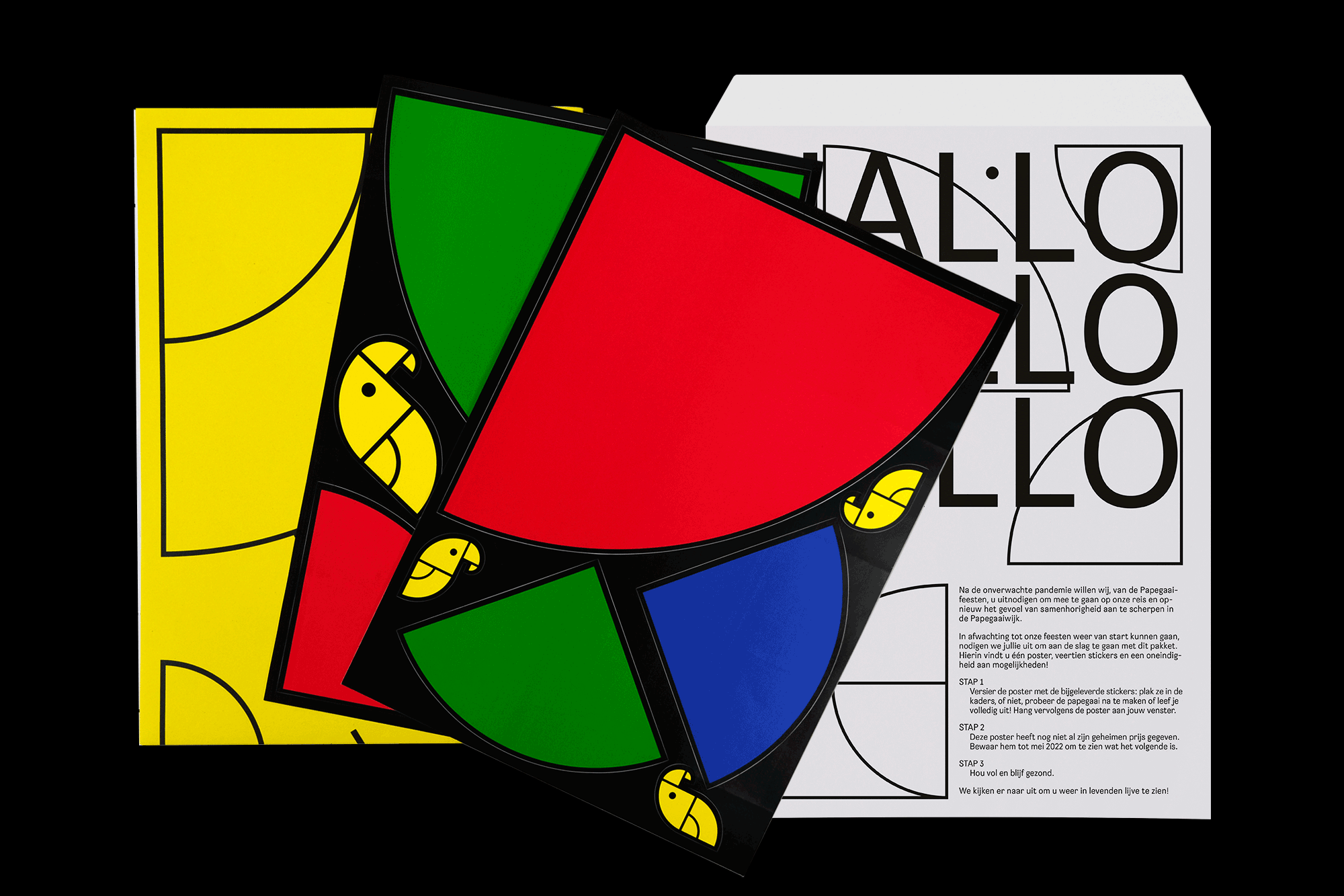
During the Covid lockdowns, when neighbourhood gatherings could not take place and people were confined indoors, the association asked for a way to keep the connection between residents alive at a distance. The response was a poster and a sheet of stickers, both built from the abstracted shapes of the Papega(e)y identity. Each household received the poster, the sticker sheets and a set of instructions through the letterbox, and composed its own version, arranging the shapes into a personal variation on the shared vocabulary. When gatherings were possible again, Studio Studio screen-printed the same fixed layer of information across every one of those compositions, so that each resident ended up with their own poster to display in the window, the whole neighbourhood promoting the Papegaaifeesten in a set of variations on one identity.