
Ponton is a magazine that sets out to build a connection between designers and the people who encounter their work, with a particular focus on young and recently graduated practitioners. The first issue centres on five emerging designers and includes interviews with a wider group of peers. Rather than presenting finished work, the magazine turns its attention to the process behind it: the ambitions, the doubts, the detours, the failures, the moments where clarity arrives late. The editorial premise is that knowledge in the design field is built at least as much through dialogue and shared uncertainty as through polished outcomes.
Studio Studio designed the magazine. Two typographic registers run through the publication in parallel. A pixelated typeface is used for material linked to the creative process itself, with varying degrees of blur and resolution that visually echo the way ideas surface gradually out of their initial fog. Alongside it, a clean sans-serif carries the sharper, more resolved passages. The two typefaces sit next to each other throughout the issue, so that the reader moves continuously between the mist of the making and the clarity of the made.
To keep the magazine navigable without forcing a linear reading, a system of keywords and labels was developed and applied across every article. The full index of labels appears at the beginning of the magazine, inviting the reader to enter the issue through whichever thread interests them most rather than from front to back.
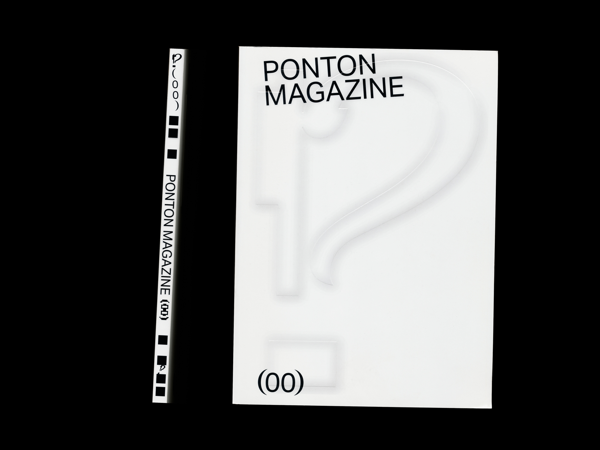
The name Ponton is carried literally into the object itself. The spine, usually treated as a technical detail, is foregrounded as the editorial centre of the magazine, and the layout is composed around it, so that the binding becomes the bridge the title describes.


