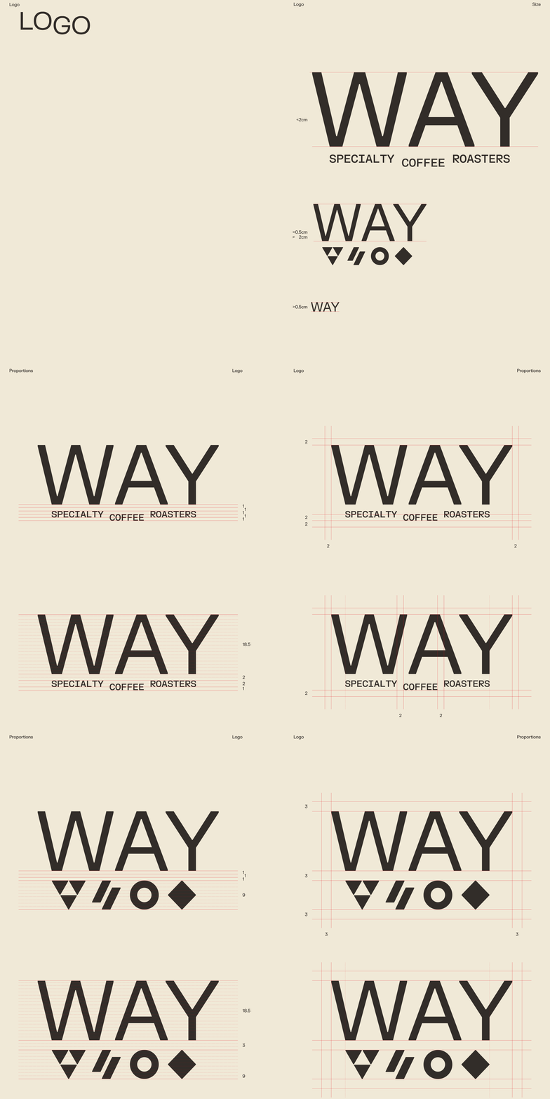
WAY is a specialty coffee roastery, coffeehouse and plant-based bakery in Ghent, founded by Charlene De Buysere and Ward De Corte. Everything is roasted in-house; the menu shifts with the seasons. The operation runs on precision, from sourcing to extraction. The brand identity needed to reflect that.
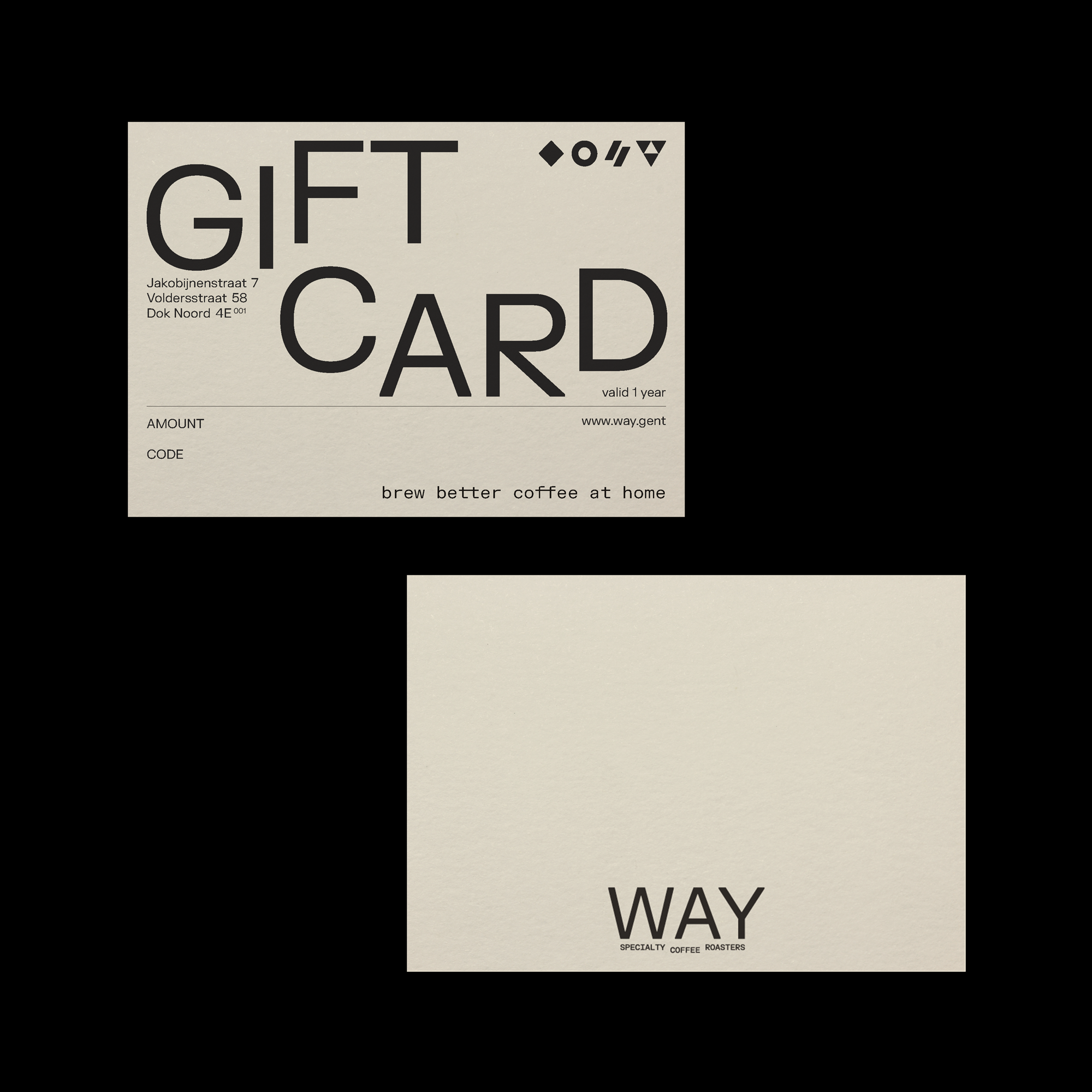
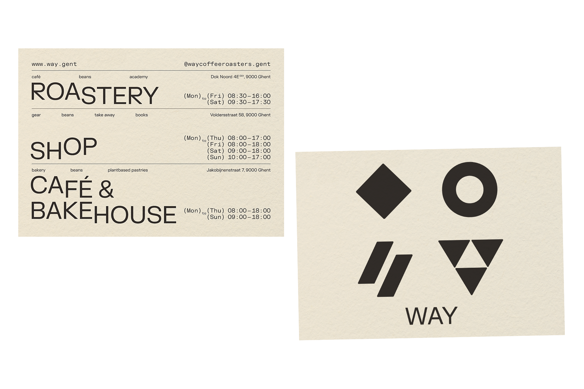
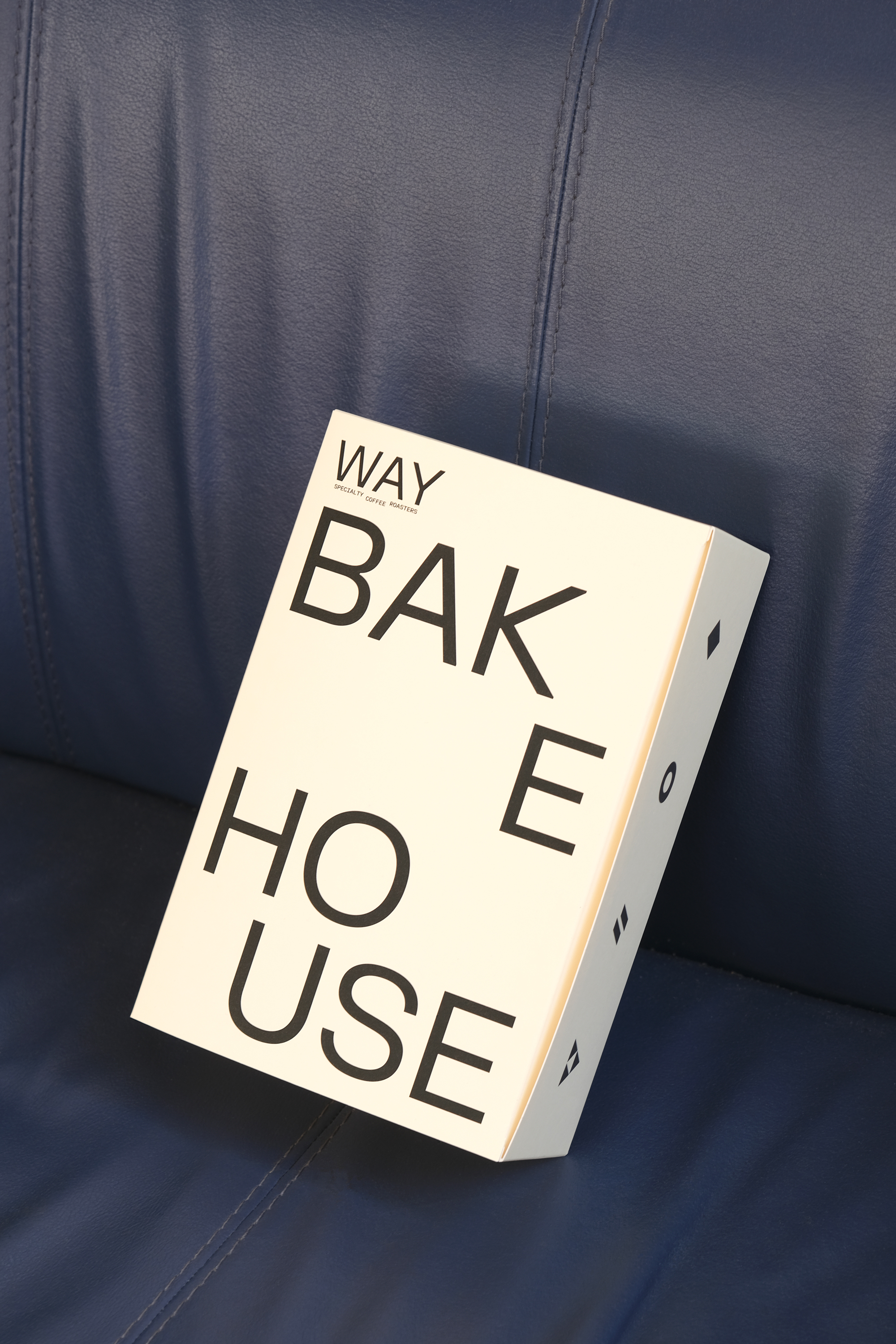
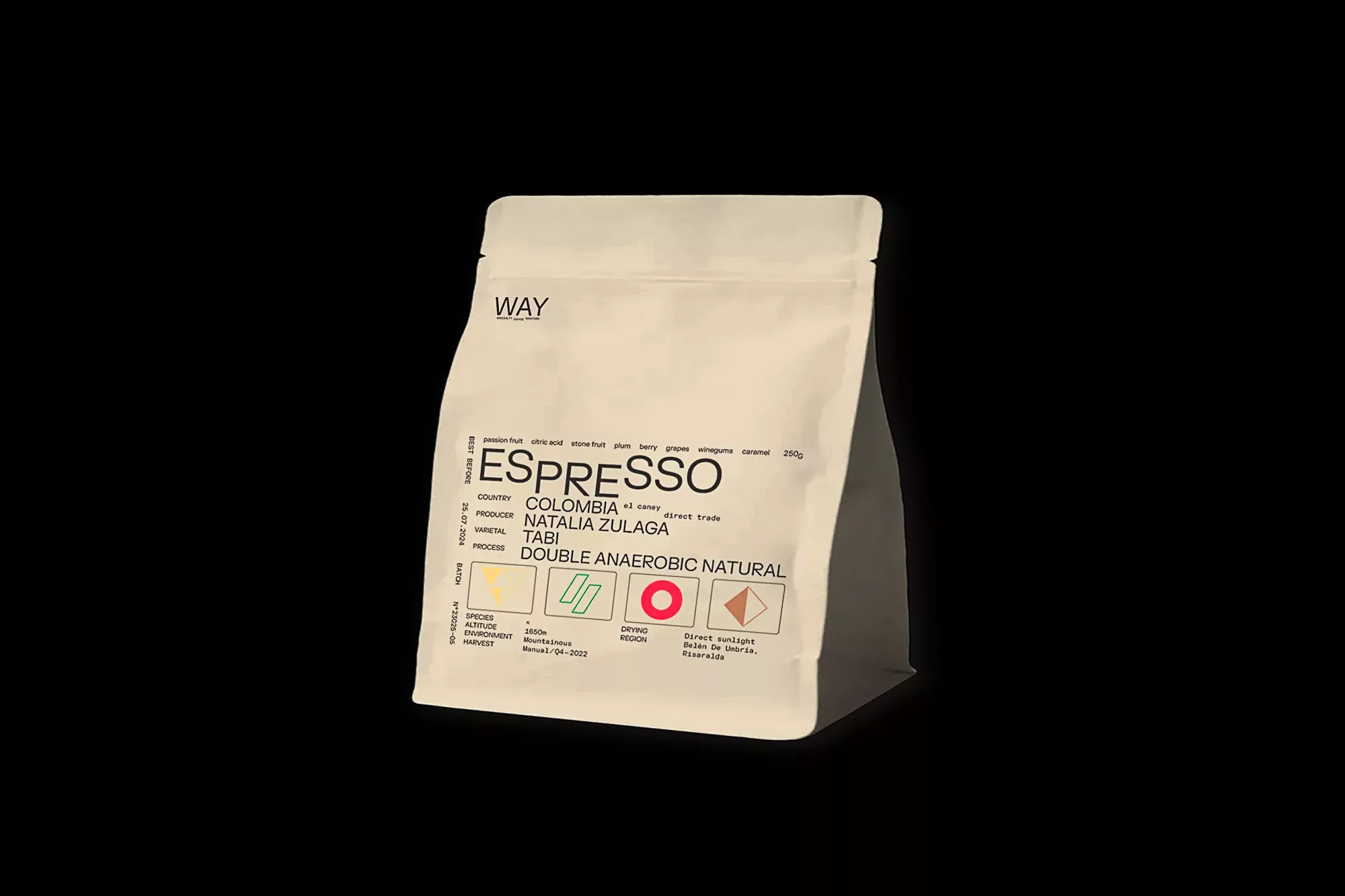
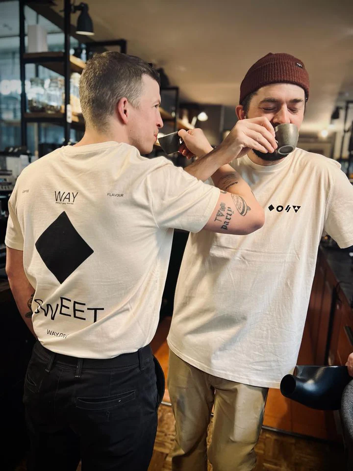
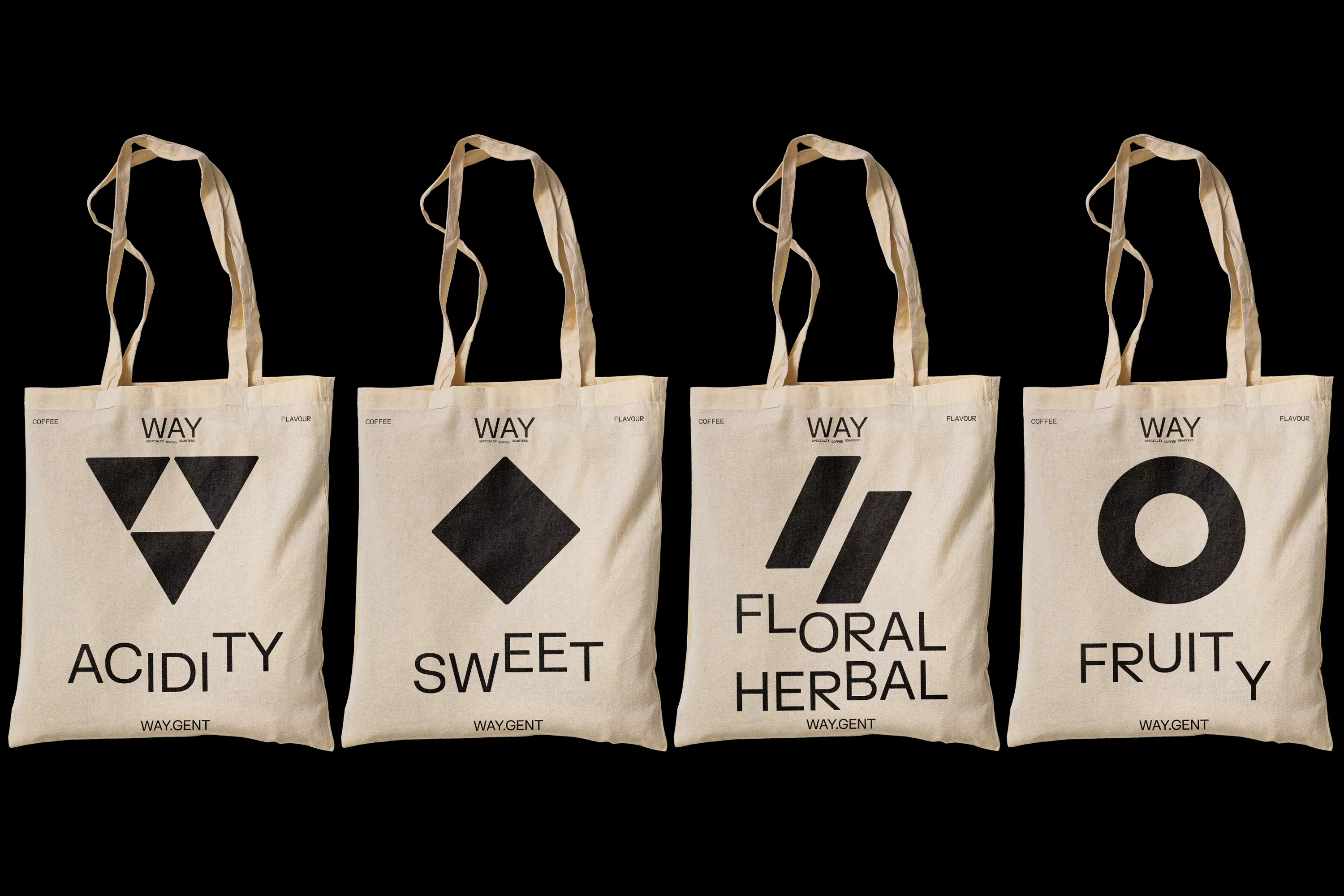
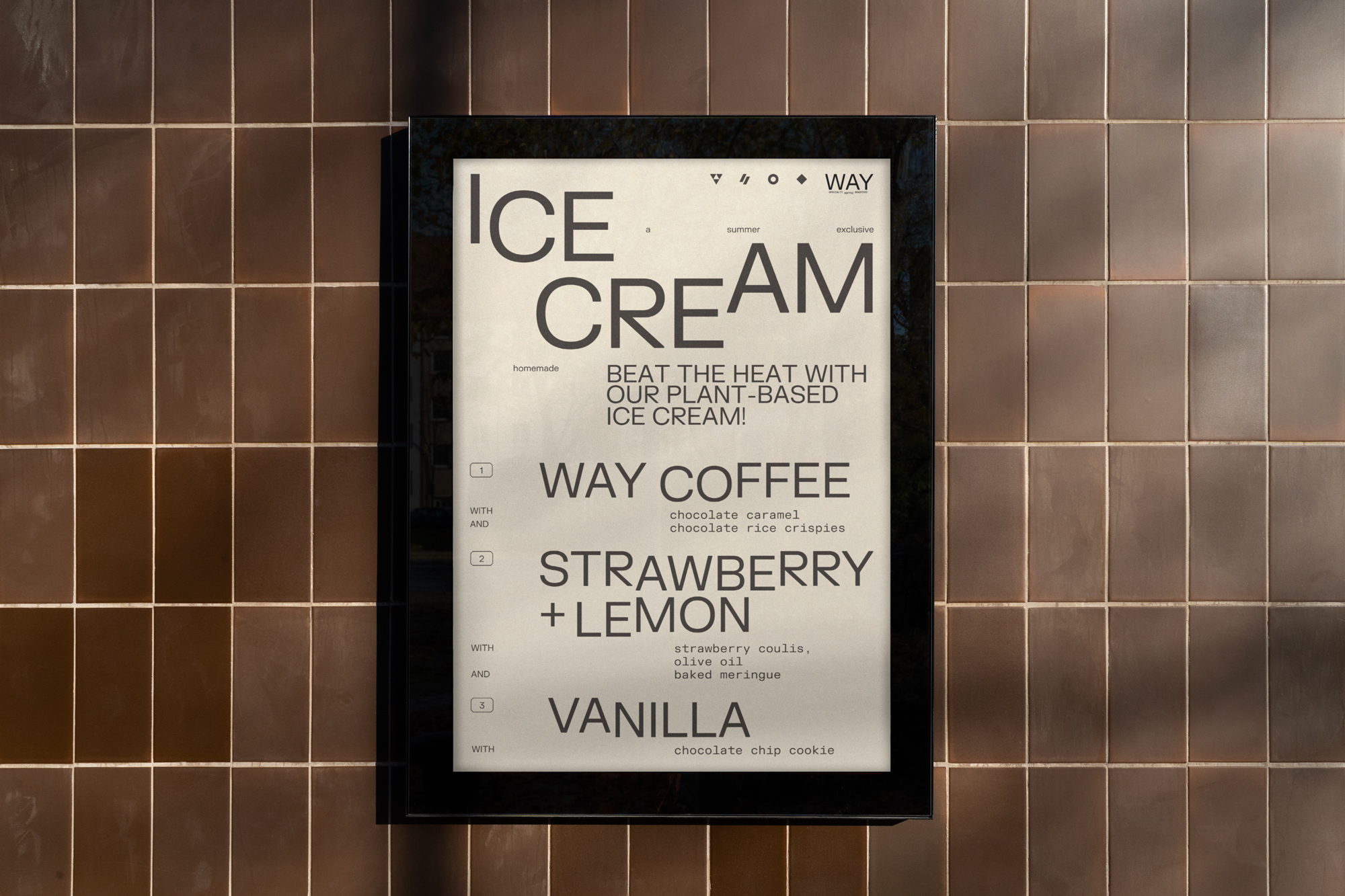
The typographic system borrows its logic from scientific notation. Type is set at varying scales within the same line, with subscripts, superscripts and deliberate shifts in line-height producing a visual rhythm that reads as both technical and alive. It is not playfulness for its own sake. It mirrors the way WAY itself communicates: exact measurements, specific origins, controlled variables. Four proprietary symbols are embedded in the system, each indexing a distinct quality of the coffee. They function as a shorthand, a compact graphic vocabulary that carries across packaging, signage and digital applications.
The identity positions WAY not as another coffeehouse with good taste, but as a roastery where taste is a matter of method.